
“So you’re a surfer that backs Exxon, huh?”
I knew what I was asking for when I placed a tiny red Pegasus sticker on the back of my truck, I could hear the joke before I peeled the sticker off its backing. As a surfer in Southern California, a Patagonia fish holding a trident is universally loved, a logo for a company that pumps gasoline for the past hundred years is something else entirely, and in typical fashion, I had no clue how to respond.
“Ha, yeah. I guess so.”
Good job idiot, way to sound smart.
“Do you get a deal at Mobil stations?” He thought he was pretty funny at this point.
“That logo doesn’t have anything to do with Mobil anymore. It sure as hell has everything to do with gasoline though.”
Man I wish I said that. That would have been cool as hell.
He had bested me and went on his way. I assumed he didn’t want to talk art history, the fabric of American iconography or brand salience vs. awareness at 10am on a Saturday morning (in wet wetsuits).
The Pegasus has taken on a life of its own over the years. Multiple generations, car culture, homeowners with a little extra wall space and artists alike. But at what point does a corporate logo become disassociated with its brand and cross over into something else? When does an image reach a level of iconography that other logos and artwork re-appropriate into new ideas entirely?
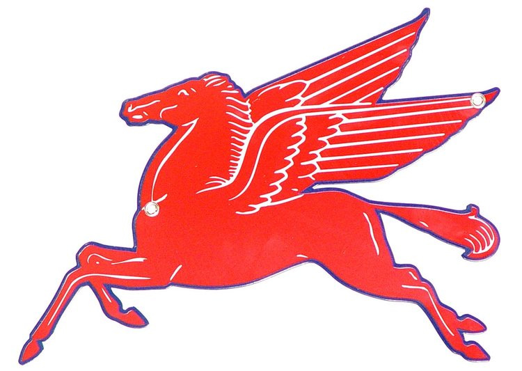
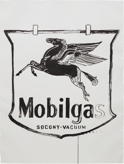
First, a little history lesson: The “Flying Red Horse,” like all things American, didn’t actually start in the good ‘ol US of A. The logo was trademarked by a subsidiary of the Vacuum Oil Company in South Africa. Vacuum Oil had built a successful lubricant company out of Rochester, New York, long before gasoline was even a branded product. The red Pegasus would eventually replace a Gargoyle as the company’s emblem and prove to last longer than its predecessor could ever dream.
By 1931 growth of the auto industry expanded Vacuum Oil to include Pegasus Spirits and Mobilgas — later simplified to Mobil. When Standard Oil of New York and Vacuum Oil combined to form Socony-Vacuum Oil Company, the new company (along with Magnolia Petroleum) adopts the logo. By 1934 it was a forty foot rotating symbol atop one of the highest building in Dallas.
Long after the 40 foot tall symbol was taken down, Andy Warhol focused in on the horse multiple times throughout his career, most notably in his collaborations with Basquiat and numerous commissioned illustrations. Warhol became credited with envisioning a new type of art that glorified (and also criticized) the nation’s impetus toward consumption. Now current artists like Skullphone are still re-working that same subject matter to apply their own meaning and point of view.
All this history would initially lead me to a traditional answer — that because of its successful past the logo has become so well known that it’s more recognizable than the brand itself. That a logo can get picked up in some sort of American zeitgeist and become something entirely new over time. Ultimately it’s what every student is taught to strive for in art school, that excellent design combined with great subject matter can create something that will live on far longer than any one person’s career.
The Mobil Pegasus is similar to the Marlboro Man, the Harley Davidson “1”, Shell Gasoline, Coca-Cola, the list goes on and on. These logos are adopted by younger generations and ever widening audiences which go on to apply entirely new meaning to these symbols given the context of their own culture. Combine those new frames of reference with the actions of any one brand and you have a living, breathing identity that can become extremely difficult to control. A good example would be the transition the Marlboro Man made from American icon to something much darker for a new generation of non-smokers. One could argue that the Pegasus symbolizes American gasoline more than any specific petroleum company. These campaigns became so successful that they came into a life of their own entirely.
"I just paint things I always thought were beautiful, things you use every day and never think about."
– ANDY WARHOL
The winged horse’s long history wasn’t entirely satisfactory though, it’s just more complicated than that. If it was entirely up to length of time, everyone would be buying old metal Coca-Cola signs. Damnit, they are doing that.
Whatever.
Coca-Cola isn’t the same. It’s a successful brand image and the history is a result of that success. But focusing on the history ignores the fact that the horse represents a piece of Americana that we all want to see as part of ourselves. This larger than life awareness is because the horse sits at a crossroads where idealism, classic cool and history meet. And more importantly, a part of the fabric of America that we all see as part of ourselves.
Fast cars, the smell of gasoline and the red Pegasus go in hand and hand. James Dean had a Pegasus decal over the left front wheel well on his Porsche (dubbed “The Little Bastard”). As embarrassing as fully knowing that every action movie known to man has done these ideas to death, we still all want our little part in it. Many of us have this desire to see ourselves associated with that version of America, and the Mobil logo sits in the perfect position of everything we all want to be (or seen to be).
Had I one of the old metal signs hanging on my wall I doubt the surfer I met in the parking lot would have made the same joke. I get it, the red sticker on the back of my truck does make it seem like I rep the brand as some sort of hardcore consumer. But to me the Pegasus seemed as good as the American flag.I am just as guilty as anyone of wanting to associate myself with that version of America.
I’m still not entirely sure how the long career of the Pegasus has crossed over, of if its only crossed over for me personally. If it hasn’t crossed over and more people still think of ExxonMobil than I realize, then it’s at least still on the tipping point. Having an antique metal horse hanging on your wall doesn’t shout to the world “loyal consumer”, it’s probably proof that you love watching American Pickers and have an addiction to ebay. And I still wonder if it’s even possible to create that kind of brand awareness anymore. The larger question is; can any designer shoot for something like this ever again or is it entirely up to chance. At least I can rest easy knowing I have the rest of my career to think about it.
And if you disagree with me, let me know.